Josef “Jeff” Sipek

First Solo Cross-Country

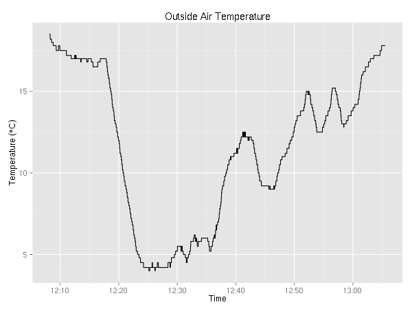
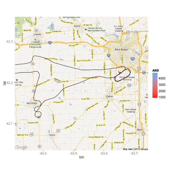
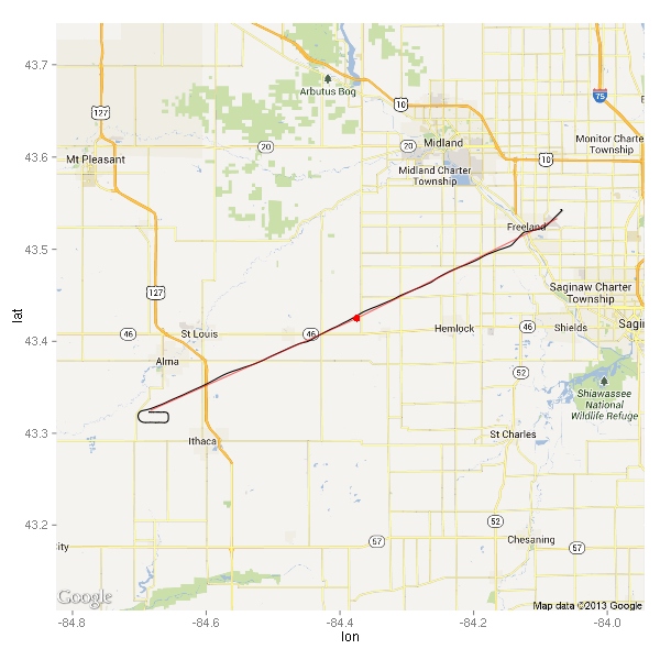
A week ago (June 15), I went on my first solo cross country flight. The plan was to fly KARBKMBSKAMN → KARB. In case you don’t happen to have the Detroit sectional chart in front of you, this might help you visualize the scope of the flight.

leg distance time
KARB → KMBS 79 nm 47 min
KMBS → KAMN 29 nm 20 min
KAMN → KARB 79 nm 46 min
Total 187 nm 113 min

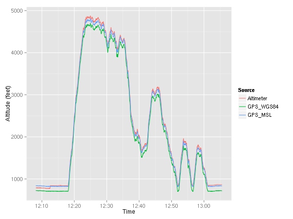
Here’s the ground track (as recorded by the G1000) along with red dots for each of my checkpoints and a pink line connecting them. (Sadly, there’s no convenient zoom level that covers the entire track without excessive waste.)

ground track

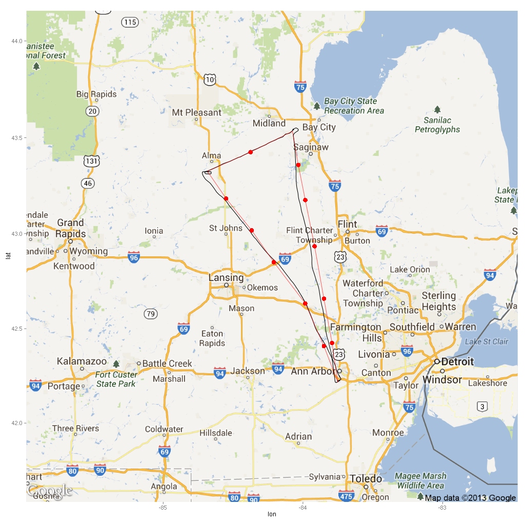
As you can see, I didn’t quite overfly all the checkpoints. In my defense, the forecast winds were about 40 degrees off from reality during the first half of the flight. :)

Let’s examine each leg separately.

KARB → KMBS

ground track

My checkpoint by I-69 (southwest of Flint) was supposed to be a I-69 and Pontiac VORTAC (PSI) radial 311 intersection. However when I called up the FSS briefer, I found out that it was out of service. Thankfully, Salem VORTAC (SVM) is very close so I just used its radial 339 instead. Next time I’m using a VOR for any part of my planning, I’m going to check for any NOTAMs before I make it part of my plan — redoing portions of the plan is tedious and not fun.

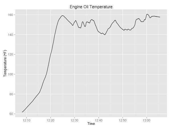
On the way to Saginaw, I was planning to go at 3500. (Yes, I know, it is a westerly direction and the rule (FAR 91.159) says even thousand + 500, but the clouds were not high enough to fly at 4500 and the rule only applies 3000 AGL and above — the ground around these parts is 700-1000 feet MSL.)

altitude

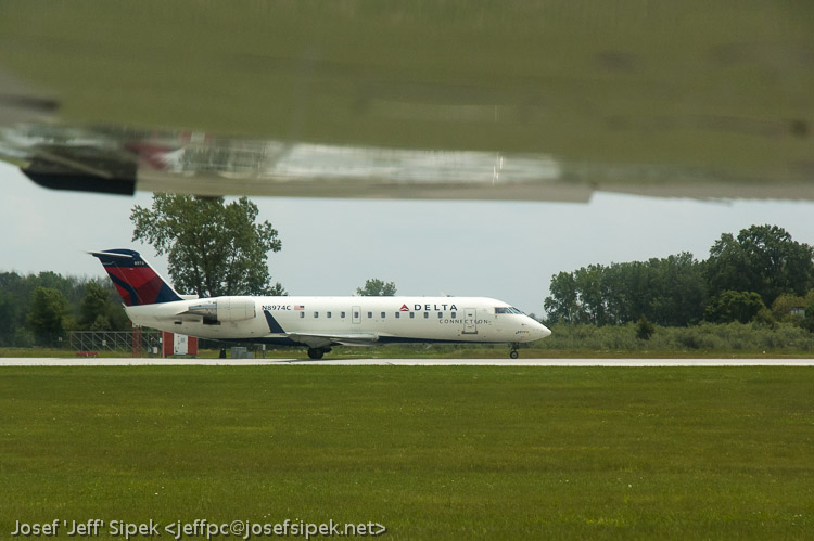
Right when I entered the downwind for runway 23, the tower cleared me to land. My clearance was quickly followed by the tower instructing a commuter jet to hold short of 23 because of landing traffic — me! Somehow, it is very satisfying to see a real plane (CRJ-200) have to wait for little ol’ me to land. (FlightAware tells me that it was FLG3903 flight to KDTW.)

While I was on taxiway C, they got cleared to take off. I couldn’t help it but to snap a photo.

CRJ-200

It was a pretty slow day for Saginaw. The whole time I was on the radio with Saginaw approach, I got to hear maybe 5 planes total. The tower was even less busy. There were no planes around except for me and the commuter jet.

KMBS → KAMN

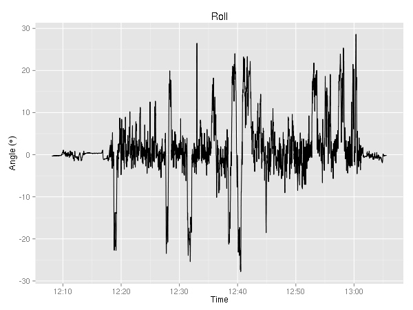
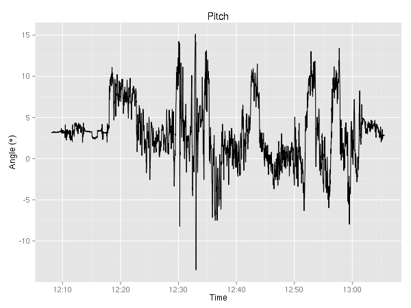
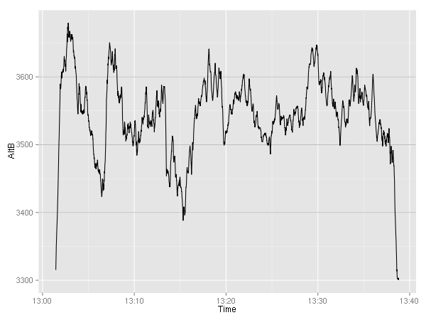
This leg of the flight was the hardest. First of all, it was only 29 nm. This equated to about 25 minutes of flying. The first four-ish and the last five-ish were spent climbing and descending, so really there was about 15 minutes of cruising. Not much time to begin with. I flew this leg by following the MBS VOR radial 248. My one and only checkpoint on this leg was mid way — the beginning of a wind turbine farm. It took about 2 minutes longer to get there than planned, but the wind turbines were easy to see from distance so no problems there.

ground track

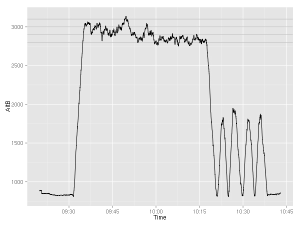
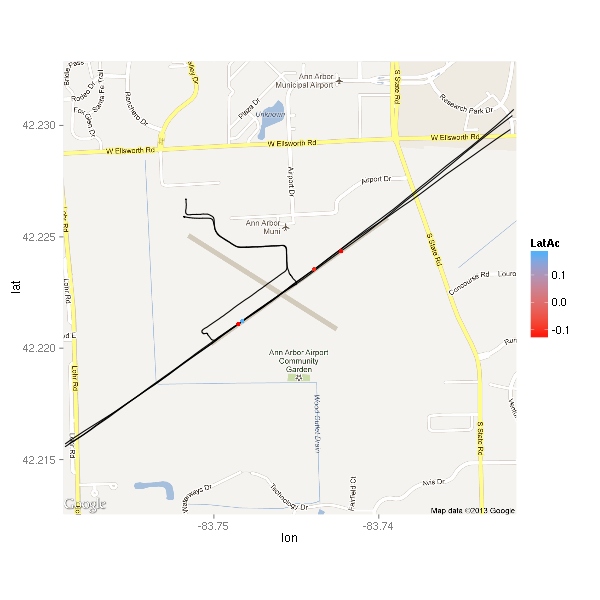
Following the VOR wasn’t difficult, but you can see in the ground track that I was meandering across it. As expected, it got easier the farther away from the station I got. Here’s the plot of the CDI deflection for this leg. The CSV file says that the units are “fsd” — I have no idea what that means.

CDI deflection

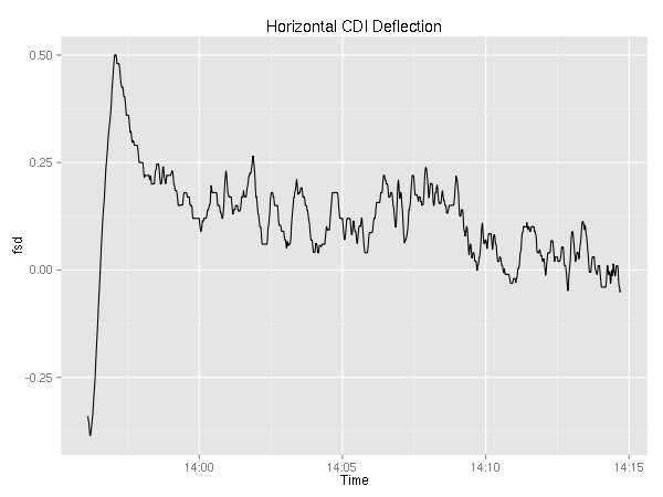
I can’t really draw any conclusions because…well, I don’t know what the graph is telling me. Sure, it seems to get closer and closer to zero (which I assume is a good thing), but I can’t honestly say that I understand what the graph is saying.

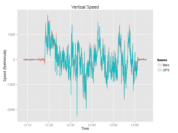
The most difficult part was trying to stay at 2500 feet. For whatever reason, it felt like I was flying in sizable thermals. Since there were no thunderstorms in the area, I flew on fighting the updrafts. That was the difficult part. I suspect the wind turbines were built there because the area is windy.

altitude

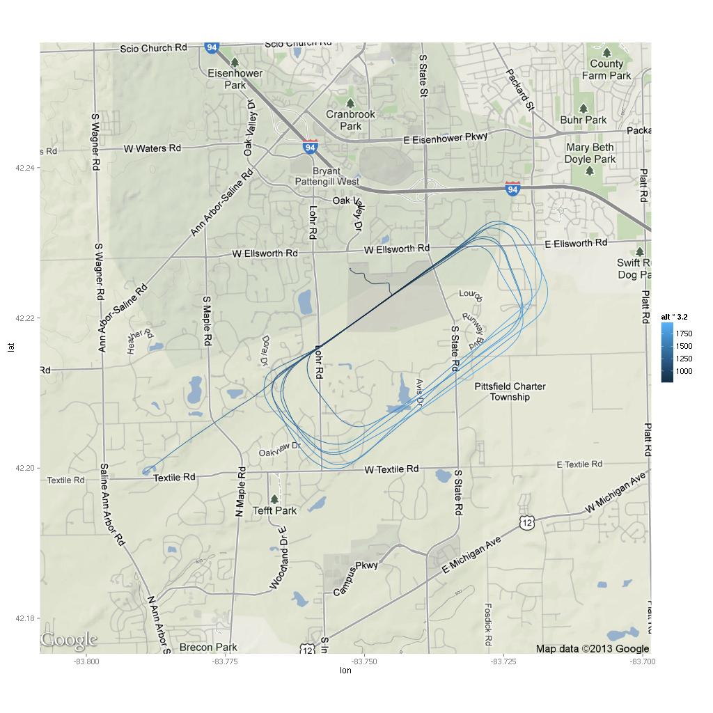
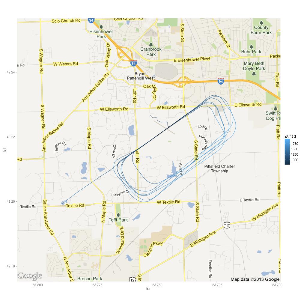
KAMN is a decent size airport. Two plenty long runways for a 172 even on a hot day (5004x75 feet and 3197x75 feet). I didn’t stop by the FBO, so I have no idea how they are. I did not notice anyone else around during the couple of minutes I spent on the ground taxiing and getting ready for the next leg. Maybe it was just the overcast that made people stay indoors. Oh well. It is a nice airport, and I wouldn’t mind stopping there in the future if the need arose.

KAMN → KARB

Flying back to Ann Arbor was the easy part of the trip. The air calmed down enough that once trimmed, the plane more or less stayed at 3500 feet.

altitude

It apparently was a slow day for Lansing approach as well, as I got to hear a controller chatting with a pilot of a skydiving plane about how fast the skydivers fell to the ground. Sadly, I didn’t get to hear the end of the conversation since the controller told me to contact Detroit approach.

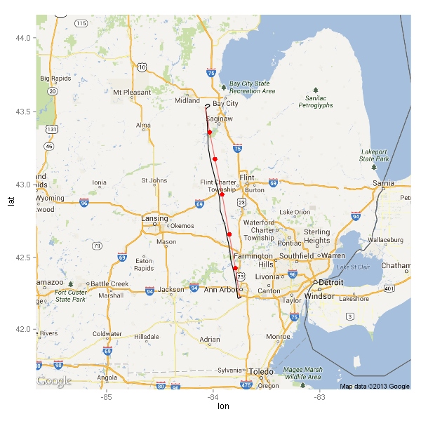
As far as the ground track is concerned, you can see two places where I stopped flying current heading and instead flew toward the next checkpoint visually. The first instance is a few miles north of KOZW. I spotted the airport, and since I knew I was supposed to overfly it, I turned to it and flew right over it. The second instance is by Whitmore Lake — there I looked into the distance and saw Ann Arbor. Knowing that the airport is on the south side, I just headed right toward it ignoring the planned heading. As I mentioned before in both cases, the planned course was slightly off because the winds weren’t quite like the forecast said they would be.

ground track

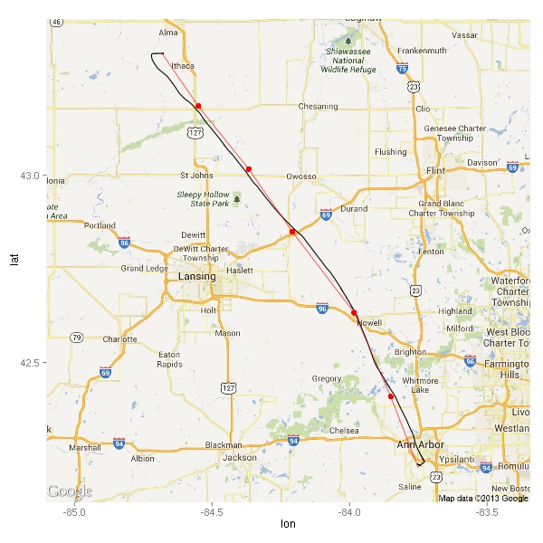
You can’t tell from the rather low resolution of the map, but I got to fly right over the Wikipedia article: Michigan stadium. Sadly, I was a bit too busy flying the plane to take a photo of the field below me.

Next

With one solo cross country out of the way, I’m still trying to figure out where I want to go next. Currently, I am considering one of these flights (in no particular order):

path distance time
KARB KGRR KMOP KARB 239 nm 2h19m
KARB KBIV KJXN KARB 220 nm 2h08m
KARB KFWA KTOL KARB 210 nm 2h03m
KARB CRUXX KFWA KTOL KARB 210 nm 2h06m
KARB LFD KFWA KTOL KARB 225 nm 2h12m
KARB KAZO KOEB KTOL KARB 207 nm 2h01m
KARB KMBS KGRR KARB 243 nm 2h21m
KARB KGRR KEKM KARB 266 nm 2h40m

Plotting G1000 EGT

It would seem that my two recent posts are getting noticed. On one of them, someone asked for the EGT R code I used.

After I get the CSV file of the SD card, I first clean it up. Currently, I just do it manually using Vim, but in the future I will probably script it. It turns out that Garmin decided to put a header of sorts at the beginning of each CSV. The header includes version and part numbers. I delete it. The next line appears to have units for each of the columns. I delete it as well. The remainder of the file is an almost normal CSV. I say almost normal, because there’s an inordinate number of spaces around the values and commas. I use the power of Vim to remove all the spaces in the whole file by using :%s/ //g. Then I save and quit.

Now that I have a pretty standard looking CSV, I let R do its thing.

> data <- read.csv("munged.csv")
> names(data)
 [1] "LclDate"   "LclTime"   "UTCOfst"   "AtvWpt"    "Latitude"  "Longitude"
 [7] "AltB"      "BaroA"     "AltMSL"    "OAT"       "IAS"       "GndSpd"   
[13] "VSpd"      "Pitch"     "Roll"      "LatAc"     "NormAc"    "HDG"      
[19] "TRK"       "volt1"     "volt2"     "amp1"      "amp2"      "FQtyL"    
[25] "FQtyR"     "E1FFlow"   "E1OilT"    "E1OilP"    "E1RPM"     "E1CHT1"   
[31] "E1CHT2"    "E1CHT3"    "E1CHT4"    "E1EGT1"    "E1EGT2"    "E1EGT3"   
[37] "E1EGT4"    "AltGPS"    "TAS"       "HSIS"      "CRS"       "NAV1"     
[43] "NAV2"      "COM1"      "COM2"      "HCDI"      "VCDI"      "WndSpd"   
[49] "WndDr"     "WptDst"    "WptBrg"    "MagVar"    "AfcsOn"    "RollM"    
[55] "PitchM"    "RollC"     "PichC"     "VSpdG"     "GPSfix"    "HAL"      
[61] "VAL"       "HPLwas"    "HPLfd"     "VPLwas"   

As you can see, there are lots of columns. Before doing any plotting, I like to convert the LclDate, LclTime, and UTCOfst columns into a single Time column. I also get rid of the three individual columns.

> data$Time <- as.POSIXct(paste(data$LclDate, data$LclTime, data$UTCOfst))
> data$LclDate <- NULL
> data$LclTime <- NULL
> data$UTCOfst <- NULL

Now, let’s focus on the EGT values — E1EGT1 through E1EGT4. E1 refers to the first engine (the 172 has only one), I suspect that a G1000 on a twin would have E1 and E2 values. I use the ggplot2 R package to do my graphing. I could pick colors for each of the four EGT lines, but I’m way too lazy and the color selection would not look anywhere near as nice as it should. (Note, if you have only two values to plot, R will use a red-ish and a blue-ish/green-ish color for the lines. Not exactly the smartest selection if your audience may include someone color-blind.) So, instead I let R do the hard work for me. First, I make a new data.frame that contains the time and the EGT values.

> tmp <- data.frame(Time=data$Time, C1=data$E1EGT1, C2=data$E1EGT2,
                    C3=data$E1EGT3, C4=data$E1EGT4)
> head(tmp)
                 Time      C1      C2      C3      C4
1 2013-06-01 14:24:54 1029.81 1016.49 1019.08 1098.67
2 2013-06-01 14:24:54 1029.81 1016.49 1019.08 1098.67
3 2013-06-01 14:24:55 1030.94 1017.57 1019.88 1095.38
4 2013-06-01 14:24:56 1031.92 1019.05 1022.81 1095.84
5 2013-06-01 14:24:57 1033.16 1020.23 1022.82 1092.38
6 2013-06-01 14:24:58 1034.54 1022.33 1023.72 1085.82

Then I use the reshape2 package to reorganize the data.

> library(reshape2)
> tmp <- melt(tmp, "Time", variable.name="Cylinder")
> head(tmp)
                 Time Cylinder   value
1 2013-06-01 14:24:54       C1 1029.81
2 2013-06-01 14:24:54       C1 1029.81
3 2013-06-01 14:24:55       C1 1030.94
4 2013-06-01 14:24:56       C1 1031.92
5 2013-06-01 14:24:57       C1 1033.16
6 2013-06-01 14:24:58       C1 1034.54

The melt function takes a data.frame along with a name of a column (I specified “Time”), and reshapes the data.frame. For each row, in the original data.frame, it takes all the columns not specified (e.g., not Time), and produces a row for each with a variable name being the column name and the value being that column’s value in the original row. Here’s a small example:

> df <- data.frame(x=c(1,2,3),y=c(4,5,6),z=c(7,8,9))
> df
  x y z
1 1 4 7
2 2 5 8
3 3 6 9
> melt(df, "x")
  x variable value
1 1        y     4
2 2        y     5
3 3        y     6
4 1        z     7
5 2        z     8
6 3        z     9

As you can see, the x values got duplicated since there were two other columns. Anyway, the one difference in my call to melt is the variable.name argument. I don’t want my variable name column to be called “variable” — I want it to be called “Cylinder.”

At this point, the data is ready to be plotted.

> library(ggplot2)
> p <- ggplot(tmp)
> p <- p + ggtitle("Exhaust Gas Temperature")
> p <- p + ylab(expression(Temperature~(degree*F)))
> p <- p + geom_line(aes(x=Time, y=value, color=Cylinder))
> print(p)

That’s all there is to it! There may be a better way to do it, but this works for me. I use the same approach to plot the different altitude numbers, the speeds (TAS, IAS, GS), CHT, and fuel quantity.

You can download an R script with the above code here.

Garmin G1000 Data Logging: Cross-Country Edition

About a week ago, I talked about G1000 data logging. In that post, I mentioned that cross-country flying would be interesting to visualize. Well, on Friday I got to do a mock pre-solo cross country phase check. I had the G1000 logging the trip.

First of all, the plan was to fly from KARB to KFPK. It’s a 51nm trip. I had four checkpoints. For the purposes of plotting the flight, I had to convert the pencil marks on my sectional chart to latitude and longitude.

> xc_checkpoints
          Name Latitude Longitude
1      Chelsea 42.31667 -84.01667
2       Munith 42.37500 -84.20833
3       Leslie 42.45000 -84.43333
4 Eaton Rapids 42.51667 -84.65833

First of all, let’s take a look at the ground track.

ground track

In addition to just the ground track, I plotted here the first three checkpoints in red, the location of the plane every 5 minutes in blue (excluding all the data points near the airport), and some other places of interest in green.

As you can see, I was always a bit north of where I was supposed to be. Right after passing Leslie, I was told to divert to 69G. I figured out the true course, and tried to take the wind into account, but as you can see it didn’t go all that well at first. When I found myself next to some oil tanks way north of where I wanted to be, I turned southeast…a little bit too much. Eventually, I made it to Richmond which was, much like all grass fields, way too hard to spot. (I’m pretty sure that I will avoid all grass fields while on my solo cross countries.)

So, how about the altitude? The plan was to fly at 4500 feet, but due to clouds being at about 3500, Wikipedia article: pilotage being the purpose of this exercise, and not planning on going all the way to KFPK anyway, we just decided to stay at 3000. At one point, 3000 seemed like a bit too close to the clouds, so I ended up at 2900. Below is the altitude graph. For your convenience, I plotted horizontal lines at 2800, 2900, 3000, and 3100 feet. (Near the end, you can see 4 touch and gos and a full stop at KARB.)

altitude

While approaching my second checkpoint, Munith, I realized that it will be pretty hard to find. It’s a tiny little town, but sadly it is the biggest “landmark” around. So, I tuned in the JXN Wikipedia article: VOR and estimated that the 50 degree radial would go through Munith. While that wouldn’t give me my location, it would tell me when I was abeam Munith. Shortly after, I changed my estimate to the 60 degree radial. (It looks like 65 is the right answer.)

> summary(factor(data$NAV1))
109.6 114.3 
 3192  1406 
> summary(factor(data$CRS))
  36   37   42   44   47   48   49   50   52   57   59   60 
1444    1    1    1    1    1    1  135    1    1    1 3010 
> head(subset(data, HSIS=="NAV1")$Time, 1)
[1] "2013-05-31 09:43:23 EDT"
> head(subset(data, NAV1==109.6)$Time, 1)
[1] "2013-05-31 09:43:42 EDT"
> head(subset(data, CRS==50)$Time, 1)
[1] "2013-05-31 09:44:26 EDT"
> head(subset(data, CRS==60)$Time, 1)
[1] "2013-05-31 09:46:48 EDT"

When I got the plane, the NAV1 radio was tuned to 114.3 (SVM) with the 36 degree radial set. At 9:43:25, I switched the input for the HSI from GPS to NAV1; at 9:43:42, I tuned into 109.6 (JXN). 44 seconds later, I had the 50 degree radial set. Over two minutes later, I changed my mind and set the 60 degree radial, which stayed there for the remainder of the flight.

In my previous post about the G1000 data logging abilities, I mentioned that the engine related variables would be more interesting on a cross-country. Let’s take a look.

engine RPM

As you can see, when reaching 3000 feet (cf. the altitude graph) I pulled the power back to a cruise setting. Then I started leaning the mixture.

fuel flow

Interestingly, just pulling the power back causes a large saving of fuel. Leaning helped save about one gallon/hour. While that’s not bad (~11%), it is not as significant as I thought it would be.

fuel

Since there was nowhere near as much maneuvering as previously, the fuel quantity graphs look way more useful. Again, we can see that the left tank is being used more.

The cylinder head temperature and exhaust gas temperature graphs are mostly boring. Unlike the previous graphs of CHT and EGT these clearly show a nice 30 minute long period of cruising. To be honest, I thought these graphs would be more interesting. I’ll probably keep plotting them in the future but not share them unless they show something interesting.

cylinder head temperature exhaust gas temperature

Same goes for the oil pressure and temperature graphs. They are kind of dull.

oil pressure oil temperature

Anyway, that’s it for today. Hopefully, next time I’ll try to look at how close the plan was to reality.

Garmin G1000 Data Logging

About a month ago I talked about using R for plotting GPS coordinates. Recently I found out that the Wikipedia article: Cessna 172 I fly in has had its G1000 avionics updated. Garmin has added the ability to store various flight data to a CSV file on an SD card every second. Aside from the obvious things such as date, time and GPS latitude/longitude/altitude it stores a ton of other variables. Here is a subset: indicated airspeed, vertical speed, outside air temperature, pitch attitude angle, roll attitude angle, lateral and vertical G forces, the NAV and COM frequencies tuned, wind direction and speed, fuel quantity (for each tank), fuel flow, volts and amps for the two buses, engine RPM, cylinder head temperature, and exhaust gas temperature. Neat, eh? I went for a short flight that was pretty boring as far as a number of these variables are concerned. Logs for cross-country flights will be much more interesting to examine.

With that said, I’m going to have fun with the 1-hour recording I have. If you don’t find plotting time series data interesting, you might want to stop reading now. :)

First of all, let’s take a look at the COM1 and COM2 radio settings.

> unique(data$COM1)
[1] 120.3
> unique(data$COM2)
[1] 134.55 120.30 121.60

Looks like I had 3 unique frequencies tuned into COM2 and only one for COM1. I always try to get the Wikipedia article: ATIS on COM2 (134.55 at KARB), then I switch to the ground frequency (121.6 at KARB). This way, I know that COM2 both receives and transmits. Let’s see how long I’ve been on the ATIS frequency…

> summary(factor(data$COM2))
 120.3  121.6 134.55 
     1   3303     70 

It makes sense, between listening to the ATIS and tuning in the ground, I spend 70 seconds listening to 134.55. The tower frequency (120.3 at KARB) showed up for a second because I switched away from the ATIS only to realize that I didn’t tune in the ground yet. Graphing these values doesn’t make sense.

I didn’t use the NAV radios, so they stayed tuned to 114.3 and 109.6. Those are the Salem and Jackson VORs, respectively. (Whoever used the NAV radios last left these tuned in.)

To keep track of one’s altitude, one must set the Wikipedia article: altimeter to what a nearby weather station says. The setting is in Inches of Mercury. The ATIS said that 30.38 was the setting to use. The altimeter was set to 30.31 when I got it. You can see that it took me a couple of seconds to turn the knob far enough. Again, graphing this variable is pointless. It would be more interesting during a longer flight where the barometric pressure changed a bit.

> summary(factor(data$BaroA))
30.31 30.32 30.36 30.38 
  262     1     1  3110 

Ok, ok… time to make some graphs… First up, let’s take a look at the outside air temperature (in °C).

> summary(data$OAT)
   Min. 1st Qu.  Median    Mean 3rd Qu.    Max. 
    4.0     6.8    12.2    11.5    16.0    18.5 

OAT

In case you didn’t know, the air temperature drops about 2°C every 1000 feet. Given that, you might be already guessing, after I took off, I climbed a couple of thousand feet.

altitude

Here, I plotted both the altitude given by the GPS (Wikipedia article: MSL as well as Wikipedia article: WGS84) and the altitude given by the altimeter. You can see that around 12:12, I set the altimeter which caused the indicated altitude to jump up a little bit. Let’s take a look at the difference between the them.

altitude difference

Again, we can see the altimeter setting changing with the sharp ~60 foot jump at about 12:12. The discrepancy between the indicated altitude and the actual (GPS) altitude may be alarming at first, but keep in mind that even though the altimeter may be off from where you truly are, the whole air traffic system plays the same game. In other words, every aircraft and every controller uses the altimeter-based altitudes so there is no confusion. In yet other words, if everyone is off by the same amount, no one gets hurt. :)

Ok! It’s time to look at all the various speeds. The G1000 reports indicated airspeed (IAS), true airspeed (TAS), and ground speed (GS).

speed

We can see the taxiing to and from the runway — ground speed around 10 Wikipedia article: kts. (Note to self, taxi slower.) The ground speed is either more or less than the airspeed depending on the wind speed.

Moving along, let’s examine the lateral and normal accelerations. The normal acceleration is seat pushing “up”, while the lateral acceleration is the side-to-side “sliding in the seat side to side” acceleration. (Note: I am not actually sure which way the G1000 considers negative lateral acceleration.)

acceleration

Ideally, there is no lateral acceleration. (See Wikipedia article: coordinated flight.) I’m still learning. :)

As you can see, there are several outliers. So, why not look at them! Let’s consider an outlier any point with more than 0.1 G of lateral acceleration. (I chose this values arbitrarily.)

> nrow(subset(data, abs(LatAc) > 0.1))
[1] 41
> nrow(subset(data, abs(LatAc) > 0.1 & AltB < 2000))
[1] 28

As far as lateral acceleration goes, there were only 41 points beyond 0.1 Gs 30 of which were below 2000 feet. (KARB’s pattern altitude is 1800 feet so 2000 should be enough to easily cover any deviation.) Both of these counts however include all the taxiing. A turn during a taxi will result in a lateral acceleration, so let’s ignore all the points when we’re going below 25 kts.

> nrow(subset(data, abs(LatAc) > 0.1 & GndSpd > 25))
[1] 26
> nrow(subset(data, abs(LatAc) > 0.1 & AltB < 2000 & GndSpd > 25))
[1] 13

Much better! Only 26 points total, 13 below 2000 feet. Where did these points happen? (Excuse the low-resolution of the map.) You can also see the path I flew — taking off from runway 6, making a left turn to fly west to the practice area.

acceleration

The moment I took off, I noticed that the Wikipedia article: thermals were not going to make this a nice smooth ride. I think that’s why there are at least three points right by the highway while I was still climbing out of KARB. The air did get smoother higher up, but it still wasn’t a nice calm flight like the ones I’ve gotten used to during the winter. Looking at the map, I wonder if some of these points were due to abrupt power changes.

Here’s a close-up on the airport. This time, the point color indicates the amount of acceleration.

acceleration

There are only 4 points displayed. Interestingly, three of the four points are negative. Let’s take a look.

                    Time LatAc  AltB  E1RPM
2594 2013-05-25 12:52:10 -0.11 879.6 2481.1
2846 2013-05-25 12:56:31 -0.13 831.6  895.8
2847 2013-05-25 12:56:32  0.18 831.6  927.4
2865 2013-05-25 12:56:50 -0.13 955.6 2541.5

The middle two are a second apart. Based on the altitude, it looks like the plane was on the ground. Based on the engine RPMs, it looks like it was within a second or two of touchdown. Chances are that it was just nose not quite aligned with the direction of travel. The other two points are likely thermals tossing the plane about a bit — the first point is from about 50 feet above ground the last is from about 120 feet. Ok, I’m curious…

> data[c(2835:2850),c("Time","LatAc","AltB","E1RPM","GndSpd")]
                    Time LatAc  AltB  E1RPM GndSpd
2835 2013-05-25 12:56:20 -0.02 876.6 1427.9  66.71
2836 2013-05-25 12:56:21  0.01 873.6 1077.1  65.71
2837 2013-05-25 12:56:22  0.01 864.6  982.4  64.21
2838 2013-05-25 12:56:23  0.04 861.6  994.1  62.77
2839 2013-05-25 12:56:24  0.01 858.6  982.6  61.54
2840 2013-05-25 12:56:25  0.01 852.6  988.2  60.18
2841 2013-05-25 12:56:26 -0.02 845.6  959.0  58.91
2842 2013-05-25 12:56:27  0.00 846.6  945.5  57.73
2843 2013-05-25 12:56:28  0.01 844.6  930.9  56.53
2844 2013-05-25 12:56:29  0.10 834.6  908.0  55.16
2845 2013-05-25 12:56:30 -0.01 827.6  886.6  54.16
2846 2013-05-25 12:56:31 -0.13 831.6  895.8  52.71
2847 2013-05-25 12:56:32  0.18 831.6  927.4  51.49
2848 2013-05-25 12:56:33 -0.06 831.6  982.0  50.21
2849 2013-05-25 12:56:34  0.05 840.6 1494.0  49.39
2850 2013-05-25 12:56:35 -0.07 833.6 2249.7  48.76

The altitudes look a little out of whack, but otherwise it makes sense. #2835 was probably the time throttle was pulled to idle. Between #2848 and #2849 throttle went full in. Ground was most likely around 832 feet and touchdown was likely at #2846 as I guessed earlier.

Let’s plot the engine related values. First up, engine RPMs.

RPM

It is pretty boring. You can see the ~800 during taxi; the 1800 during the runup; the 2500 during takeoff; 2200 during cruise; and after 12:50 you can see the go-around, touch-n-go, and full stop.

Next up, cylinder head temperature (in °F) and exhaust gas temperature (also in °F). Since the plane has a 4 cylinder engine, there are four lines on each graph. As I was maneuvering most of the time, I did not get a chance to try to lean the engine. On a cross country, it be pretty interesting to see the temperature go up as a result of leaning.

CHT

EGT

Moving on, let’s look at fuel consumption.

fuel quantity

This is really weird. For the longest time, I knew that the plane used more fuel from the left tank, but this is the first time I have solid evidence. (Yes, the fuel selector was on “Both”.) The fuel flow graph is rather boring — it very closely resembles the RPM graph.

fuel flow

Ok, two more engine related plots.

oil temperature

oil pressure

It is mildly interesting that the temperature never really goes down while the pressure seems to be correlated with the RPMs.

There are two variables with the vertical speed — one is GPS based while the other is barometer based.

vertical speed

As you can see, the two appear to be very similar. Let’s take a look at the delta. In addition to just a plain old subtraction, you can see the 60-second moving average.

vertical speed: GPS vs. Barometer

Not very interesting. Even though the two sometimes are off by as much as 560 feet/minute, the differences are very short-lived. Furthermore, the differences are pretty well distributed with half of them being within 50 feet.

> summary(data$VSpd - data$VSpdG)
     Min.   1st Qu.    Median      Mean   3rd Qu.      Max. 
-559.8000  -49.2800    0.4950    0.8252   53.0600  563.4000 
> summary(SMA(data$VSpd - data$VSpdG),2)
     Min.   1st Qu.    Median      Mean   3rd Qu.      Max.      NA's 
-240.2000  -22.2200    0.6940    0.8226   25.4700  226.7000         9 

Ok, last but not least the CSV contains the pitch and roll angles. I’ll have to think about what sort of creative analysis I can do. The only thing that jumps to mind is the mediocre S-turn around 12:40 where the roll changed from about 20 degrees to -25 degrees.

Roll

Pitch

I completely ignored the volts and amps variables (for each of the two busses), all the navigation related variables (waypoint identifier, bearing, and distance, Wikipedia article: HSI source, course, Wikipedia article: CDI/Wikipedia article: GS deflection), wind (direction and speed), as well as ground track, magnetic heading and Wikipedia article: variation, GPS fix (it was always 3D), GPS horizontal/vertical alert limit, and WAAS GPS horizontal/vertical protection level (I don’t think the avionics can handle WAAS — the columns were always empty). Additionally, since I wasn’t using the autopilot, a number of the fields are blank (Autopilot On/Off, mode, commands).

Ideas

A while ago I learned about CloudAhoy. Their iPhone/iPad app uses the GPS to record your flight. Then, they do some number crunching to figure out what kind of maneuvers you were doing. (I contacted them a while ago to see if one could upload a GPS trace instead of using their app, sadly it was not possible. I do not know if that has changed since.) I think it’d be kind of cool to write a (R?) script that’d take the G1000 recording and do similar analysis. The big difference is the ability to use the great number of other variables to evaluate the pilot’s control of the airplane — ranging from coordinated flight and dangerous maneuvers (banking too aggressively while slow), to “did you forget to lean?”.

Update (2016-10-10): Out of the blue, I got an email from the CloudAhoy guys letting me know that a lot has changed since I wrote this post three and a half years ago and that they support uploading of lots of different flight data file formats. They seem to have some very interesting ways of visualizing the data. I think I’ll have to play with it in the near future.

Plotting with ggmap

Recently, I came across ggmap package for R. It supposedly makes for some very easy plotting on top of Google Maps or OpenStreetMap. I grabbed a GPS recording I had laying around, and gave it a try.

You may recall my previous attempts at plotting GPS data. This time, the data file I was using was recorded with a USB GPS dongle. The data is much nicer than what a cheap smartphone GPS could produce.

> head(pts)
        time   ept      lat       lon   alt   epx    epy mode
1 1357826674 0.005 42.22712 -83.75227 297.7 9.436 12.755    3
2 1357826675 0.005 42.22712 -83.75227 297.9 9.436 12.755    3
3 1357826676 0.005 42.22712 -83.75227 298.1 9.436 12.755    3
4 1357826677 0.005 42.22712 -83.75227 298.4 9.436 12.755    3
5 1357826678 0.005 42.22712 -83.75227 298.6 9.436 12.755    3
6 1357826679 0.005 42.22712 -83.75227 298.8 9.436 12.755    3

For this test, I used only the latitude, longitude, and altitude columns. Since the altitude is in meters, I multiplied it by 3.2 to get a rough altitude in feet. Since the data file is long and goes all over, I truncated it to only the last 33 minutes.

The magical function is the get_map function. You feed it a location, a zoom level, and the type of map and it returns the image. Once you have the map data, you can use it with the ggmap function to make a plot. ggmap behaves a lot like ggplot2’s ggplot function and so I felt right at home.

Since the data I am trying to plot is a sequence of latitude and longitude observations, I’m going to use the geom_path function to plot them. Using geom_line would not produce a path since it reorders the data points. Second, I’m plotting the altitude as the color.

Here are the resulting images:

If you are wondering why the line doesn’t follow any roads… Roads? Where we’re going, we don’t need roads. (Hint: flying)

Here’s the entire script to get the plots:

#!/usr/bin/env Rscript

library(ggmap)

pts <- read.csv("gps.csv")

/* get the bounding box... left, bottom, right, top */
loc <- c(min(pts$lon), min(pts$lat), max(pts$lon), max(pts$lat))

for (type in c("roadmap","hybrid","terrain")) {
	print(type)
	map <- get_map(location=loc, zoom=13, maptype=type)
	p <- ggmap(map) + geom_path(aes(x=lon, y=lat, color=alt*3.2), data=pts)

	jpeg(paste(type, "-preview.jpg", sep=""), width=600, height=600)
	print(p)
	dev.off()

	jpeg(paste(type, ".jpg", sep=""), width=1024, height=1024)
	print(p)
	dev.off()
}

P.S. If you are going to use any of the maps for anything, you better read the terms of service.

Powered by blahgd