Garmin G1000 Data Logging: Cross-Country Edition
About a week ago, I talked about G1000 data logging. In that post, I mentioned that cross-country flying would be interesting to visualize. Well, on Friday I got to do a mock pre-solo cross country phase check. I had the G1000 logging the trip.
First of all, the plan was to fly from KARB to KFPK. It’s a 51nm trip. I had four checkpoints. For the purposes of plotting the flight, I had to convert the pencil marks on my sectional chart to latitude and longitude.
> xc_checkpoints
          Name Latitude Longitude
1      Chelsea 42.31667 -84.01667
2       Munith 42.37500 -84.20833
3       Leslie 42.45000 -84.43333
4 Eaton Rapids 42.51667 -84.65833
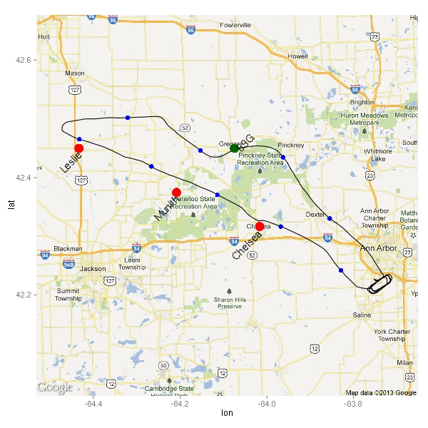
First of all, let’s take a look at the ground track.
In addition to just the ground track, I plotted here the first three checkpoints in red, the location of the plane every 5 minutes in blue (excluding all the data points near the airport), and some other places of interest in green.
As you can see, I was always a bit north of where I was supposed to be. Right after passing Leslie, I was told to divert to 69G. I figured out the true course, and tried to take the wind into account, but as you can see it didn’t go all that well at first. When I found myself next to some oil tanks way north of where I wanted to be, I turned southeast…a little bit too much. Eventually, I made it to Richmond which was, much like all grass fields, way too hard to spot. (I’m pretty sure that I will avoid all grass fields while on my solo cross countries.)
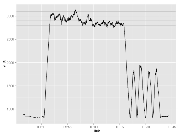
So, how about the altitude? The plan was to fly at 4500 feet, but due to clouds being at about 3500,  pilotage being the purpose of this exercise, and not planning on going all the way to KFPK anyway, we just decided to stay at 3000. At one point, 3000 seemed like a bit too close to the clouds, so I ended up at 2900. Below is the altitude graph. For your convenience, I plotted horizontal lines at 2800, 2900, 3000, and 3100 feet. (Near the end, you can see 4 touch and gos and a full stop at KARB.)
While approaching my second checkpoint, Munith, I realized that it will be pretty hard to find. It’s a tiny little town, but sadly it is the biggest “landmark” around. So, I tuned in the JXN  VOR and estimated that the 50 degree radial would go through Munith. While that wouldn’t give me my location, it would tell me when I was abeam Munith. Shortly after, I changed my estimate to the 60 degree radial. (It looks like 65 is the right answer.)
> summary(factor(data$NAV1))
109.6 114.3
 3192  1406
> summary(factor(data$CRS))
  36   37   42   44   47   48   49   50   52   57   59   60
1444    1    1    1    1    1    1  135    1    1    1 3010
> head(subset(data, HSIS=="NAV1")$Time, 1)
[1] "2013-05-31 09:43:23 EDT"
> head(subset(data, NAV1==109.6)$Time, 1)
[1] "2013-05-31 09:43:42 EDT"
> head(subset(data, CRS==50)$Time, 1)
[1] "2013-05-31 09:44:26 EDT"
> head(subset(data, CRS==60)$Time, 1)
[1] "2013-05-31 09:46:48 EDT"
When I got the plane, the NAV1 radio was tuned to 114.3 (SVM) with the 36 degree radial set. At 9:43:25, I switched the input for the HSI from GPS to NAV1; at 9:43:42, I tuned into 109.6 (JXN). 44 seconds later, I had the 50 degree radial set. Over two minutes later, I changed my mind and set the 60 degree radial, which stayed there for the remainder of the flight.
In my previous post about the G1000 data logging abilities, I mentioned that the engine related variables would be more interesting on a cross-country. Let’s take a look.
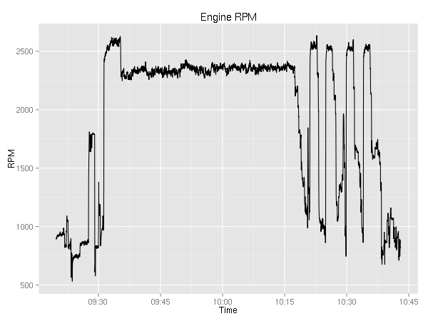
As you can see, when reaching 3000 feet (cf. the altitude graph) I pulled the power back to a cruise setting. Then I started leaning the mixture.
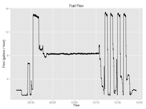
Interestingly, just pulling the power back causes a large saving of fuel. Leaning helped save about one gallon/hour. While that’s not bad (~11%), it is not as significant as I thought it would be.
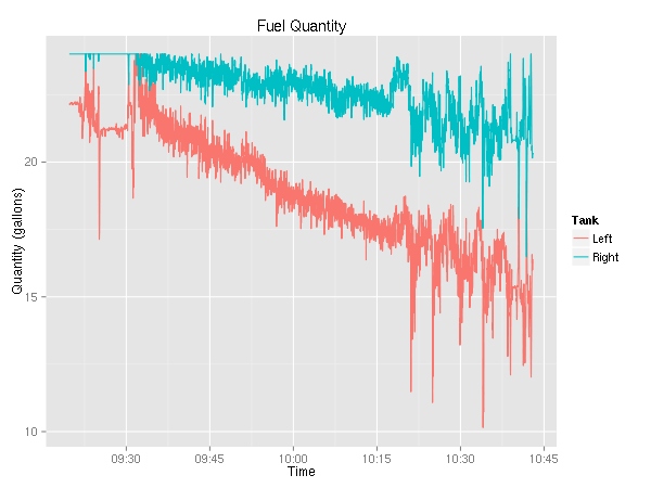
Since there was nowhere near as much maneuvering as previously, the fuel quantity graphs look way more useful. Again, we can see that the left tank is being used more.
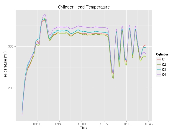
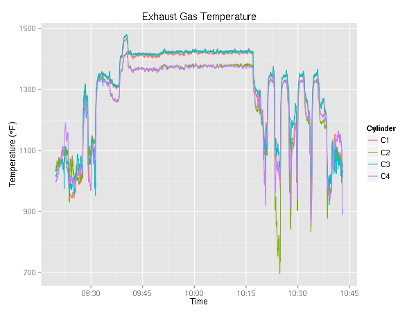
The cylinder head temperature and exhaust gas temperature graphs are mostly boring. Unlike the previous graphs of CHT and EGT these clearly show a nice 30 minute long period of cruising. To be honest, I thought these graphs would be more interesting. I’ll probably keep plotting them in the future but not share them unless they show something interesting.
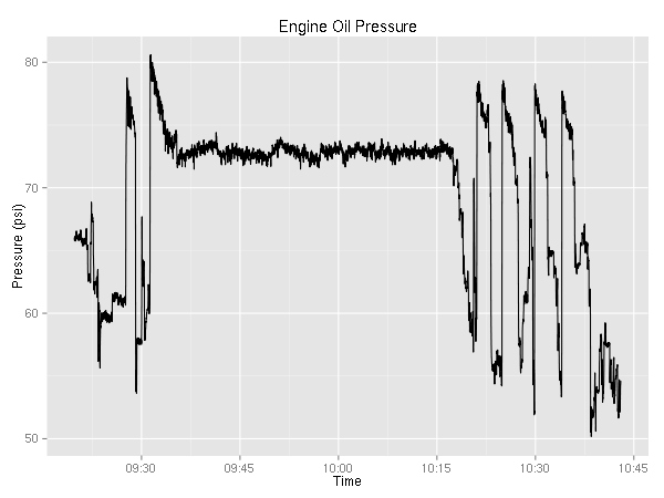
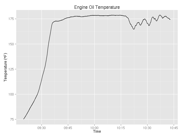
Same goes for the oil pressure and temperature graphs. They are kind of dull.
Anyway, that’s it for today. Hopefully, next time I’ll try to look at how close the plan was to reality.
