Josef “Jeff” Sipek

2017-03-23

The million dollar engineering problem — Scaling infrastructure in the cloud is easy, so it’s easy to fall into the trap of scaling infrastructure instead of improving efficiency.

Some Notes on the “Who wrote Linux” Kerfuffle

The Ghosts of Internet Time

How a personal project became an exhibition of the most beautifully photographed and detailed bugs you ever saw — Amazing photos of various bugs.

Calculator for Field of View of a Camera and Lens

The Megaprocessor — A microprocessor built from discrete transistors.

Why Pascal is Not My Favorite Programming Language

EAA Video — An assortment of EAA produced videos related to just about anything aircraft related (from homebuilding to aerobatics to history).

The Unreasonable Effectiveness of Recurrent Neural Networks

The Mobile Cat

About three weeks ago I got the idea to put a phone in front of the cat and use it to light her. It took a while for everything to align (she needed to be resting just the right way, it had to be dark, and I had to notice and have my camera handy), but I think the result was worth it:

D750: A Year In Statistics

It has been a year since I got the D750 and I thought it would be fun to gather some statistics about the photos.

While I have used a total of 5 different lenses with the D750, only three of them got to see any serious use. The lenses are:

Nikon AF Nikkor 50mm f/1.8D
This is the lens I used for the first month. Old, cheap, but very good.
Nikon AF Nikkor 70-300mm f/4-5.6D ED
I got this lens many years ago for my D70. During the first month of D750 ownership, I couldn’t resist seeing what it would behave like on the D750. It was a disaster. This lens just doesn’t create a good enough image for the D750’s 24 megapixel sensor.
Nikon AF-S Nikkor 24-120mm f/4 ED VR
I used this lens when I test-drove the D750, so technically I didn’t take these with my camera. With that said, I’m including it because it makes some of the graphs look more interesting.
Nikon AF-S Nikkor 24-70mm f/2.8G ED
After a month of using the 50mm, I got this lens which became my walk around lens.
Nikon AF-S Nikkor 70-200mm f/2.8G ED VR II
Back in June, Nikon had a sale and that ended up being just good enough to convince me to spend more money on photography gear.

Now that we’ve covered what lenses I have used, let’s take a look at some graphs. First of all, the number of images taken with each lens:

Not very surprising. Since June, I have been taking with me either the 24-70mm, or 70-200mm, or both if the extra weight is not a bother. So it is no surprise that the vast majority of my photos have been taken with those two lenses. The 50mm is all about that first month when I had a new toy (the D750!) and so I dragged it everywhere. (And to be fair, the 50mm lens is so compact that it is really easy to drag it everywhere.) The 230 photos taken with the 70-300mm are all (failed) attempts at plane spotting photography.

First, let’s look at the breakdown by ISO (in 1/3 stop increments):

This is not a surprising graph at all. The D750’s base ISO is 100 and the maximum native ISO is 12800. It is therefore no surprise that most of the photos were taken at ISO 100.

I am a bit amused by the spikes at 200, 400, and 800. I know exactly why these happen—when I have to adjust the exposure by a large amount, I tend to scroll the wheels a multiple of three notches.

Outside of the range, there are a couple of photos (52) taken at ISO 50 (which Nikon calls “Lo 1”) to work around the lack of an ND filter. There is actually one other photo outside of the native ISO range that I did not plot at all—the one photo I took at ISO 51200 (“Hi 2”) as a test.

Now, let’s break the numbers down differently—by the aperture used (again in 1/3 stop increments):

I am actually surprised that so many of them are at f/2.8. I’m well aware that most lenses need to be stepped down a little for best image quality, but apparently I don’t do that a third of the time. It is for this kind of insight that I decided to make this blahg post.

Moving on to focal length. This is by far the least interesting graph.

You can clearly see 4 large spikes—at 24 mm, 50 mm, 70 mm, and 200 mm. All of those are because of focal length limits of the lenses. Removing any data points over 500 yields a slightly more readable graph:

It is interesting that the focal length that is embedded in the image doesn’t seem to be just any integer, but rather there appear to be “steps” in which it changes. The step also isn’t constant. For example, the 70-200mm lens seems to encode 5 mm steps above approximately 130 mm but 2-3 mm below it.

I realize this is a useless number given that we are dealing with nothing like a unimodal distribution, but I was curious what the mean focal length was. (I already know that the most common ones are 24 mm and 70 mm for the 24-70mm, and 70 mm and 200 mm for the 70-200mm lens.)

Lens Mean Focal Length Count
24-120    73.24138 87
24-70    46.72043 6485
50    50.00000 1020
70-200    151.69536 4438
70-300    227.82609 230

Keep in mind these numbers include the removed spikes.

Just eyeballing the shutter speed data, I think that it isn’t even worth plotting.

So, that’s it for this year. I found the (basic) statistics interesting enough, and I learned that I stay at f/2.8 a bit too much.

Flying around Mount Monadnock

Last week I planned on doing a nice cross country flight from Wikipedia article: Fitchburg. Inspired by Garrett Fisher’s photos, I took my camera and the 70-200mm lens with me hoping to get a couple of nice photos of the landscapes in New Hampshire.

Sadly, after taking off from KFIT I found out that not only was there the stiff wind that was forecasted (that’s fine) but the air was sufficiently bumpy that it wouldn’t have been a fun flight. On top of that, the ADS-B unit was having problems acquiring a GPS signal. (Supposedly, the firmware sometimes gets into a funny state like this. The good news is that there is a firmware update available that should address this.) I contacted KASH tower to check if they could see my transponder—they did, so I didn’t have to worry about being totally invisible.

Since I was already off the ground, I decided to do some nearby sightseeing, landing practice, and playing with the Garmin GNS 430 GPS.

First, I headed northwest toward Wikipedia article: Mount Monadnock. While I have seen it in the distance several times before, I never got to see it up close, so this seemed like a worthwhile destination.

As I approached it, I ended up taking out my camera and getting a couple of photos of the hills and mountains in New Hampshire. It was interesting how the the view to the north (deeper into New Hampshire) is hilly, but the view more east (and certainly south) is flatter. (Both taken near Mount Monadnock.)

While the visibility was more than good enough for flying, it didn’t work out that well for photography. In all of the photos, the landscape far away ended up being heavily blue-tinted. No amount of playing around with white balance adjustment in Lightroom was able to correct it. (Either the background was too blue, or the foreground was too yellow/brown.) That’s why all of these photos are black and white.

I made a full turn around Monadnock, taking a number of shots but this one is my favorite:

Once done with Monadnock, I headed south to the Wikipedia article: Quabbin Reservoir in Massachusetts. This is a view toward the south from near its north end:

At this point I started heading to KORH to do some landing practice. Since I was plenty busy, there are no photos.

I’ve never been to this airport before and landing at new airports is always fun. The first interesting thing about it is that it is situated on a hill. While most airports around here are at 200-400 feet MSL, this one is at 1000 feet. The westerly wind favored runway 29 which meant I got to see a second interesting aspect of this airport. The beginning of runway 29 is on the edge of the hill. That by itself doesn’t sound very interesting, but consider that the runway is at 1000 feet while the bottom of the hill (a mere 0.9 km away) is at 500 feet MSL. That is approximately a 17% grade. So, as you approach the runway, at first it looks like you are way too high but the ground comes up significantly faster than normal.

I am still hoping to do my originally planned cross country flight at some point. Rest assured that I will blahg about it.

Plane-spotting in Manchester, NH

Last weekend I got to drive to Wikipedia article: Manchester, so I used the opportunity to kill some time near the airport by watching planes and taking photos (gallery).

The winds were coming from the south, so runway 17 was in use. I think those are the best plane spotting conditions at KMHT.

It is relatively easy to watch aircraft depart and fly directly overhead:

Unlike all my previous plane spotting, this time I tried something new—inspired by Mike Kelly’s Airportraits, I decided to try to make some composite images. Here is a Southwest Boeing 737 sporting one of the Wikipedia article: special liveries:

It was certainly an interesting experience.

At first I thought that I would be able to use the 7 frames/second that the D750 can do for the whole departure, but it turns out that the planes move far too slowly, so the camera buffer filled up way too soon and the frame rate became somewhat erratic. What mostly ended up working was switching to 3 frames/second and taking bursts. Next time, aiming for about 2 frames/second should give me enough images to work with.

Even though I used a tripod, I expected that I would have to align the images to remove the minor misalignment between images due to the vibration from the rather strong wind and my hand depressing the shutter. It turns out that the misalignment (of approximately 10 pixels) was minor enough that it did not change the final image.

Here’s an American Airlines commuter taking off from runway 17. (I repositioned to get a less head-on photo as well.)

For those curious, I post processed each of the images in Lightroom, exported them as TIFFs, and then used GIMP to do the layering and masking. Finally, I exported the final image and imported it back into Lightroom for safekeeping.

As a final treat, as I was packing up a US Army Gulfstream took off:

As far as I can tell, they use this one to transport VIPs. I wonder who was on board…

Visiting Helsinki

Back in July and August I got to visit Helsinki. Needless to say, I dragged my camera and lenses along and did some sightseeing. Helsinki is a relatively new but welcoming city.

July

My first trip there was in early July (7th-10th). This meant that I was there about two weeks after the summer solstice. At 60°10’ north, this has been the northernmost place I’ve ever been. (I’m not really counting the layover in Reykjavik at 63°59’ north, although I do have an interesting story about that for another time.) If you combine these two relatively boring facts (very far north and near solstice timing), you end up with nearly 19 hours of daylight! This gave me ample time to explore. Below are a couple of photos I took while there. There are more in the gallery.

Approaching Wikipedia article: Senate Square and the Wikipedia article: Helsinki Cathedral:

The cathedral:

Not far from this (Lutheran) cathedral is an Eastern Orthodox cathedral—Wikipedia article: Uspenski Cathedral.

And here is its interior:

Like a number of other cities in Europe, Helsinki is filled with bikes. Most sidewalks seem to be divided into two parts—one for walking and one for biking. The public transit seems to include bike rentals. These rental bikes are very…yellow.

Suomenlinna

On Saturday, July 9th, I took a ferry to the nearby sea fortress—Wikipedia article: Suomenlinna—where I spent the day.

Of course there is a (small) church there. (You can also see it in the above photo in the haze.) This one has a sea-fortress-inspired chain running around it.

The whole fortress is made up of six islands. This allows you to see some of the fortifications up close as well as at some distance.

There are plenty of small buildings of various types scattered around the islands. Some of them are still used as residences, while others got turned into a museum or some other public space.

August

The August trip was longer and consisted of more roaming around the city.

The Helsinki Cathedral in the distance.

There are a fair number of churches—here is the Wikipedia article: Kamppi Chapel.

Heading west of the city center (toward Wikipedia article: Länsisatama) one cannot miss the fact that Helsinki is a coastal city.

Finally, on the last day of my August trip I got to see some sea creatures right in front of the cathedral. They were made of various pieces of plastic. As far as I could tell, this art installation was about environmental awareness.

I took so long to finish writing this post that I’ve gotten to visit Helsinki again last month…but more about that in a separate post. Safe travels!

iPhone 7 "Review"

I stopped by an Apple Store nearby, and played with the new iPhone 7 for a couple of minutes. Why? I have an iPhone 5s which is still working, but it is lacking some nice-to-have features. I got the 5s back in the day because I got fed up with my Galaxy Nexus—it got unusably slow, and I wasn’t really a fan of the screen size (it was too big). That’s right, I wanted a phone screen that was smaller so I could use it with just one hand. The iPhone 5s fit the bill perfectly.

Now, it is 2016 and the 5s is getting a bit old and the 7 just came out. Should I upgrade? The iPhone 7 is better in just about every way, but the screen…it’s bigger than the 5s’s. (Yes, I realize it’s the same as the 6 and 6s.)

Trying it out

My main goal with playing with the phone at the store was to see if I was OK with the size. I made sure to type on the keyboard both one-handed and two-handed, browse some websites (mostly scrolling around), and see which screen locations were hard to reach.

The new home button is certainly interesting. It is a fingerprint reader (this is nothing new by itself) with haptic feedback. So, “pressing” it results in a similar sensation to what the physical button provided in the previous models. It’s not the same exact feel, but it was surprisingly good. It felt like the feedback was coming from near the home button, not just the whole phone vibrating.

The phone certainly felt bigger than my current one. The test drive wasn’t long enough for me to make a determination based on this alone.

One-handed operation

While playing with the phone, I made an interesting “discovery” about my one-handed use of phones. Apparently, I hold smartphones one of two ways. If I am typing, I hold the phone further down; on the other hand, if I am mostly scrolling, I hold it closer to its center of gravity. Needless to say, this affects how far on the screen my thumb can reach.

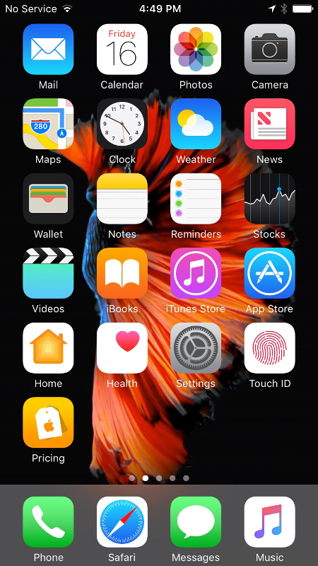
When I’m holding the phone near the center of gravity, all icons (see above screenshot) except the top row and the Maps app are easy to reach. The Mail app is essentially impossible to reach without shifting the phone in my hand. The remaining ones are doable, but it takes more effort than just moving my thumb over.

If I’m holding the phone lower down (e.g., because I was just typing), then the top two rows of icons are hard to use—with the top left corner (i.e., Mail) being impossible to reach.

There is an accessibility option (called “Reachability”) which shifts the whole screen down 30–40%. This makes the top two rows of icons reachable. (Once enabled, trigger it by double-tapping the home button.) While it is neat that this is available, it feels a bit like a hack.

Specs

When I got home, I decided to make a table of the physical specs. Specifically, the physical dimensions, weight, and the screen size. In addition to the two iPhones, I included the Galaxy Nexus (my previous phone) and the Samsung Galaxy S7 (the current flagship Samsung Galaxy phone).

Phone Size (mm) Weight Screen
iPhone 5s 123.8 x 58.6 x 7.6 112g 100mm, 1136x640
iPhone 7 138.3 x 67.1 x 7.1 138g 120mm, 1334x750
Galaxy Nexus 135.5 x 67.94 x 9.47 135g 118mm, 1280x720
Samsung Galaxy S7 142.4 x 69.6 x 7.9 152g 130mm, 2560x1440

When I first made this table, I was surprised at how close the iPhone 7 is to the Galaxy Nexus. Size-wise within a couple of mm! Weight-wise only a 3 g difference. The good news is, I can use my 2.5 years of Galaxy Nexus use as a guide to answer my question about the iPhone size. The bad news is, I didn’t really like the screen size on the Galaxy Nexus.

Conclusion

I think the conclusion is clear—I am going to wait to see if Apple makes a smaller version over the next year. Until then, I will stick with my 5s.

Septemberfest 2016 - Birds of Prey

This past weekend, the Dunstable Rural Land Trust had its annual Septemberfest event (yes, it ended up being in early October this year). Holly and I went to it armed with the cameras hoping to get some nice images of birds from the “Birds of Prey” program. We were not disappointed.

So far, I have managed to sift through only the bird photos. I still have to go through the other ones (e.g., the colorful autumn shots) and figure out which are the keepers. I set up a gallery which I’ll update with the non-bird photos in the near future.

Without further ado, here are the birds!

The peregrine falcon:

The screech owl:

The great horned owl:

The Harris’s hawk:

The red-tailed hawk:

The American kestrel:

The golden eagle:

This is only a fraction of the photos that are in the gallery, so make sure to check it out for more avian goodness.

First Attempt at Food Photography

Yesterday evening, I decided that making dinner and photography should be combined more often. As a result, I dragged my camera, the 70-200mm zoom, the flash, and the tripod to the kitchen to try my hand at taking some photos of scrambled eggs—or to be more specific, scrambled eggs as they were cooking.

The fully extended tripod left the Arca-Swiss plate about nose-level. With the D750 with the 70-200mm on top, the LCD on the camera was just above my head. The swiveling LCD on the camera was rather useful and made it significantly easier to review test shots, and mess with the flash output.

As far as the food itself is concerned, I prepared two bowls—one with five cracked eggs, and the other with some shredded ham slices and swiss cheese slices.

Here is a (terrible) diagram showing the setup from above to better explain it.

The four-circle thing in the middle is the stove, with the skillet on the bottom right burner (the scribble with a handle sticking out). The camera on the tripod is in the bottom right corner of the diagram. To the left of the stove is the flash. It’s on top of a cardboard box that the 70-200mm came in. Above the stove is a stove hood with a couple of lights pointing down at the stove top.

I used a wooden spatula in the otherwise empty skillet to have something to focus on. After I got the focus right where I expected the food to be, I switched to manual focus. In the process of taking those test shots, I ended up concluding that I need both the flash and the stove hood and kitchen lights to get something resembling the right kind of lighting. Of course the kitchen light color temperature did not match the flash, so I grabbed the orange gel and put it on the flash. (This is the first time I used a gel on a flash!) It worked.

It was time to start cooking! Once the bacon grease on the skillet got hot enough, I poured the eggs in, and quickly moved to the camera to get some more test shots—to make sure that the exposure, focus, and composition were good. I ended up tweaking the focus and flash output.

After I scrambled the eggs a little, I dumped the ham and cheese on top and moved it around a bit to avoid a large mountain of ham and cheese. Then it was time to go back to the camera—to get the final shots.

Even though I was zoomed in near 200 mm, I ended up cropping significantly to get the shot I wanted. I suppose this would have been a good time to use a macro lens (which I do not have).

I set up a gallery for my food photography, but so far the only image there is the one above. Obviously, this means that I have to take more food photos. :)

Changing timezone in irssi at runtime

About a year ago, I moved my irssi-in-a-screen into a separate zone on my server. I installed the new zone, installed screen and irssi inside it. And started it all up. After a little while, I realized that the zone was set to UTC. (By default, OmniOS zones start with their timezone set to UTC.) That’s easy enough to change by editing /etc/default/init and restarting anything that has the timezone cached in the environment. Which includes irssi. In general, I don’t like restarting irssi because it is a bit of a pain to rejoin the channels I want to be in temporarily.

Well, it turns out that there is a way to change irssi’s timezone setting at runtime!

/script exec $ENV{'TZ'}='US/Eastern'

I definitely did not expect something like this to work, but it does. (Yes, yes, I know this is on the irssi tips and tricks page.)

Powered by blahgd